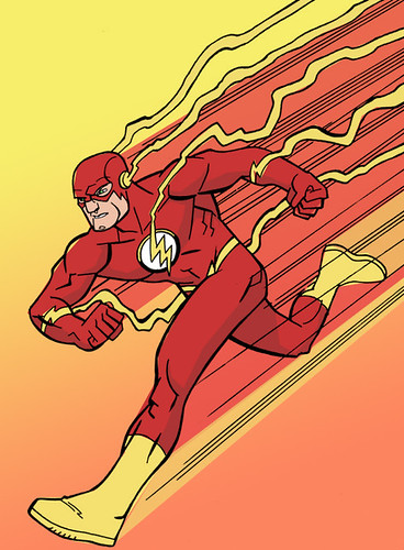
So here's one of the Flashes Jason Latour drew for me that I have now colored.
Below are 3 alternate versions of the same coloring job.. the backgrounds are different.


Feel free to tell me which of the 4 you prefer.
Friday, July 20, 2007
It's so dark.
Subscribe to:
Post Comments (Atom)


3 comments:
i like 'em all. but personally, i'd go for either the one with the black background, or the one with the gradient background without the halftone pattern. again, just personal preference. cool, nonetheless.
Those two are probably my favorites as well.
hi!
i liked the 3rd one with the yellow background!
:)
Post a Comment